the Eyes, the sword, and the remedy.
book one of the Sons of prophecy series

Five-Star review from the Reader Views Book Awards!
The Eyes, The Sword, and the Remedy is the first novel in a five-part series, setting the stage for a world unraveling at the seams—experienced through characters who misunderstand the roles they play within it.
At its core, the story explores the weight of legacy, the blur between myth and truth, and the cost of knowledge. Each character is pulled into a conflict far greater than themselves, navigating choices in the dark without knowing what their decisions may awaken.
Symbolism is woven into every detail: the fog creeping into view, slowly surrounding them; the cold, blue hues of the forest enclosing them; their distressed expressions mirroring their confusion and unease. The imagery captures the heart of the story—a journey shaped by questions, instinct, and the search for clarity in a world that offers none.
Follow my journey in crafting this series—shaped by passion, creativity, and a love for storytelling.
Read the full review from Reader Views.
Book Covers, Sigils, and Official Character Art
Concept
The first book in The Sons of Prophecy series practically wrote itself. It came together gradually—built from ideas that emerged organically over time. I knew the beginning and the end; everything in between wove itself into place, expanding naturally from two books to four, and eventually five. It was the characters—each one I grew to love—that drove the story forward at every step.
That same passion fed directly into the design of the book itself. From the beginning, I knew I wanted it to be a hardcover. I had a vision and created mock-ups, then set out to learn everything I needed to bring that vision to life—even when I wasn’t entirely sure what it would become. What I did know was that I wanted a design that felt compelling, mysterious, and reflective of the story within. Once the front cover was made, everything else came after.
Planning
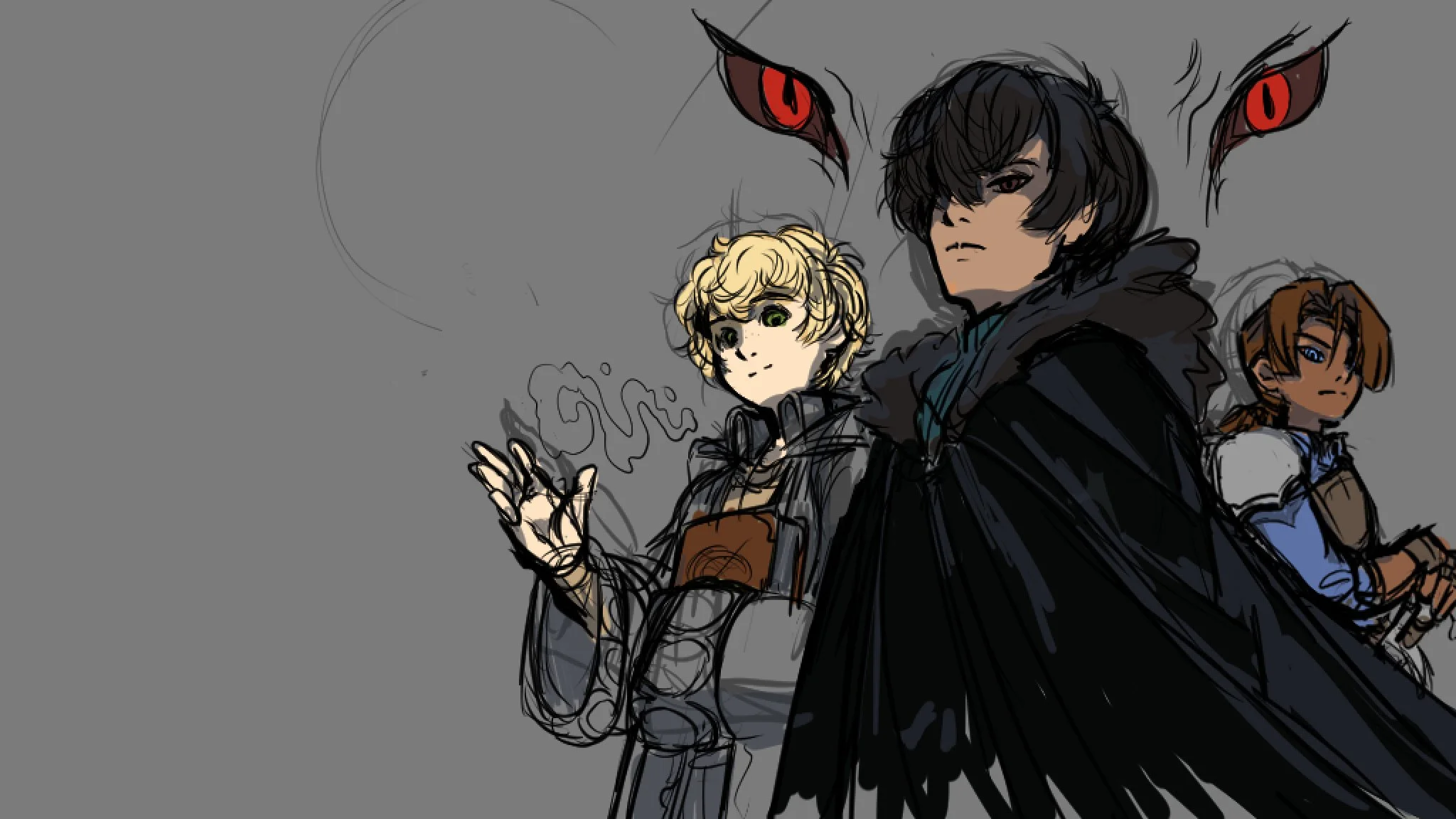
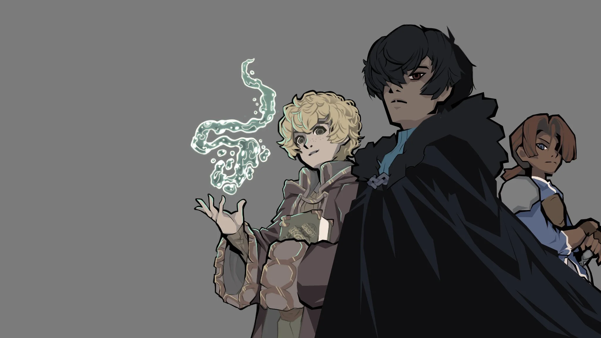
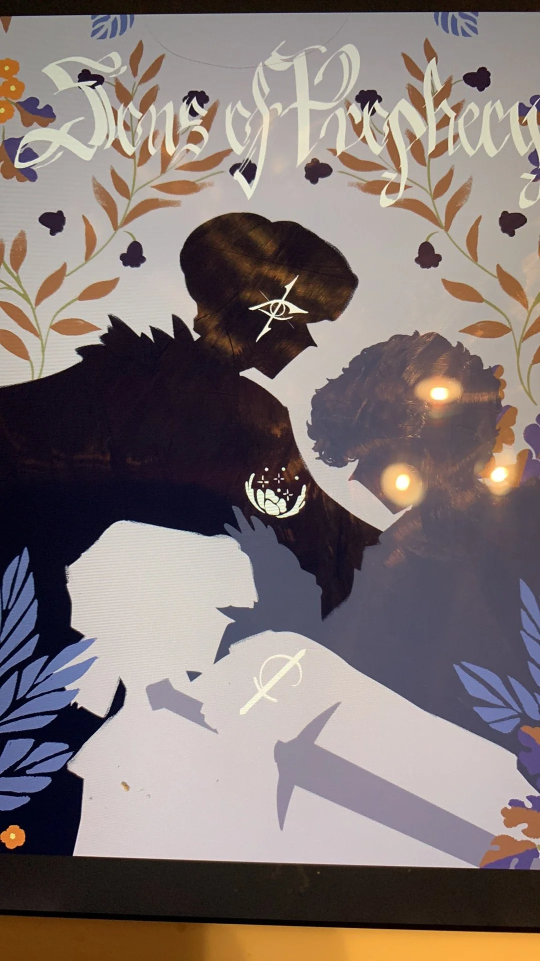
The cover art for The Eyes, The Sword, and The Remedy features the three main characters gazing out at the reader—each with an expression that reveals little, yet says everything. Lance looks angry, Crow remains unreadable, and Sage wears a faint but friendly smile. Who are they looking at?
The clash of emotion between them mirrors the confusion and distrust woven through their story arcs. Are they facing a friend, an enemy—or someone they’re not yet sure they can trust?
The book design came together gradually, piece by piece. I created exclusive sigils for each character and their title—symbols that are reflected on the covers and evolve depending on who appears on the cover of each instalment.
The final dust jacket design went on a journey, from something amateur to something I couldn't believe I designed. The image of swirling butterflies and wind-blown leaves in the bottom right corner was changed to a single autumn leaf, making the cover cleaner and fitting for the tone of the story. The leaf also became the ornamental break for the book as well.
Each book in the series will feature its own ornamental motif, representing the season in which the finale take place. This image showcases both the hardcover jacket and the paperback cover, demonstrating how the design remains cohesive and interchangeable across formats.
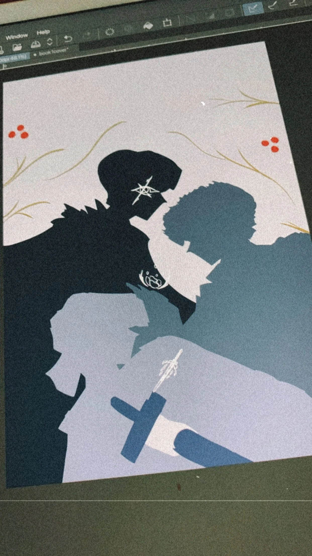
While publishing the book I took on several roles beyond writing, including designing character art, merchandise, book covers, and logos. I also prepared print-ready files and worked with editors and manufacturers, handling things like RGB/CMYK colour formats, bleed, margins, and other print requirements to ensure everything was ready for production.
Foiled Hardcover Case
The casebound foil design was a last-minute decision for the Kickstarter. Since I was already producing a hardcover edition, I didn’t want to leave the case cover bare—I wanted to go all out.
There was little planning involved; the design came together from start to finish exactly as it was meant to be. I prepared the file using Illustrator, followed bleed guideline requirements from Bookvault, and received beautifully crafted hardcovers with the final addition foil.
Each novel’s hardcover will feature a custom foil case, themed around the season in which the story takes place. This one reflects autumn through its weary forest imagery, hints of mysticism, and a touch of magic. The crow, sword, and herbs subtly reference the book’s title.

Paperback
Book Design
Part Pages
For the hardcover, I knew from the beginning that I wanted to include illustrations for each of the five acts.
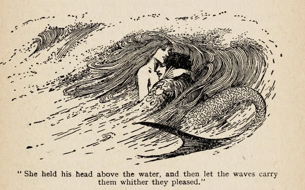
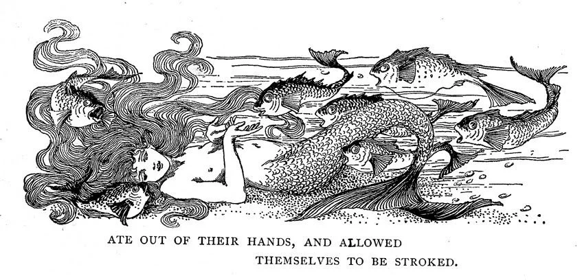
I was particularly inspired by the work of Helen Stratton, best known for her fairytale illustrations—especially her rendition of The Little Mermaid by Hans Christian Andersen.
One of the things I take pride in is my ability to emulate different artistic styles when it suits the aesthetic. For this project, I wanted to evoke a classic fairytale atmosphere in both the hardcover and paperback editions, and Stratton’s delicate, whimsical style was the perfect fit.
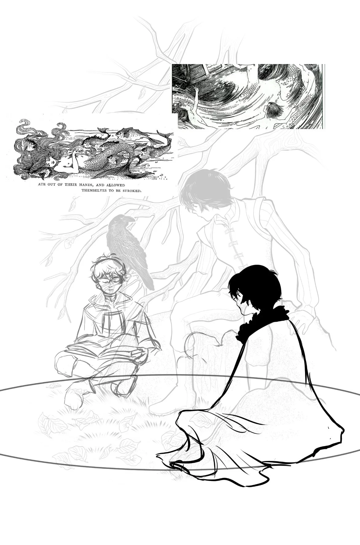


end sheets
The end sheet’s final design was originally intended to be the book’s cover. After graduating university, I had fallen out of love with design—lacking the motivation to create. It wasn’t until I dove headfirst into developing this series that my passion reignited.
The backing design was inspired by a clipboard I own—artist unknown. The illustrated figures drew inspiration from the first edition Biddy Tarot.
You can also see my first attempt at a logo here. At the time, I prioritized illustration over design—a classic misstep.
Still, after completing the official cover, I knew I didn’t want to let this early piece go to waste. That’s how it became the end sheet artwork, and ultimately, the inspiration for the interior design of the books that followed.


Kickstarter Inside Dust jacket art Process
This painting was originally intended for a limited edition hardcover. However, during the campaign, offering a LE version proved too complicated. Instead, the artwork became the underside of the dust jacket—a hidden poster that backers could hang up and enjoy while reading the book.
My inspiration came from the cover of Los Secretos del Inspector, where the artist cleverly embedded all the foreshadowed elements within the Inspector’s silhouette. While I initially tried to emulate a similar painterly style digitally, it wasn’t my strength—and after much frustration, I turned to traditional paints. Once Crow’s portrait was complete, I knew it didn’t need any additional characters. It was whole on its own.
Map Design
The Map of Finnigan’s Land—the setting for the novel—was fun to create. It was also one of the first things created, following the three leads and their mother.
I sketched it by pouring rice on a tabloid piece of paper, and formed it into the rough shape I envisioned the province to be. When the outline was done, I attempted to make it as a topographical map, but found it limiting in showing important locations and landmarks.
Making the map is a heaven-sent decision for any author. It vastly improved my own understanding of which direction characters faced or traveled in, while also giving me a more accurate timeline between one location to another.
Finnigan’s Land is inspired by the Banff and Kootenay National Parks, Canada.
Character Design
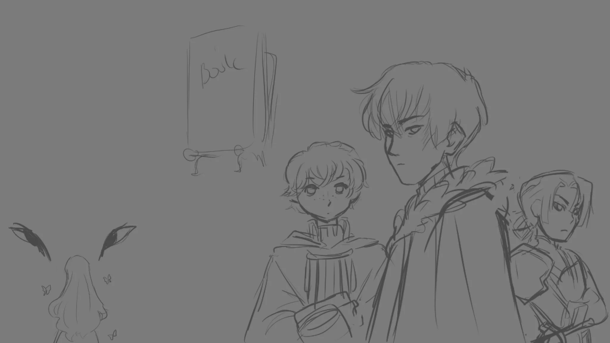
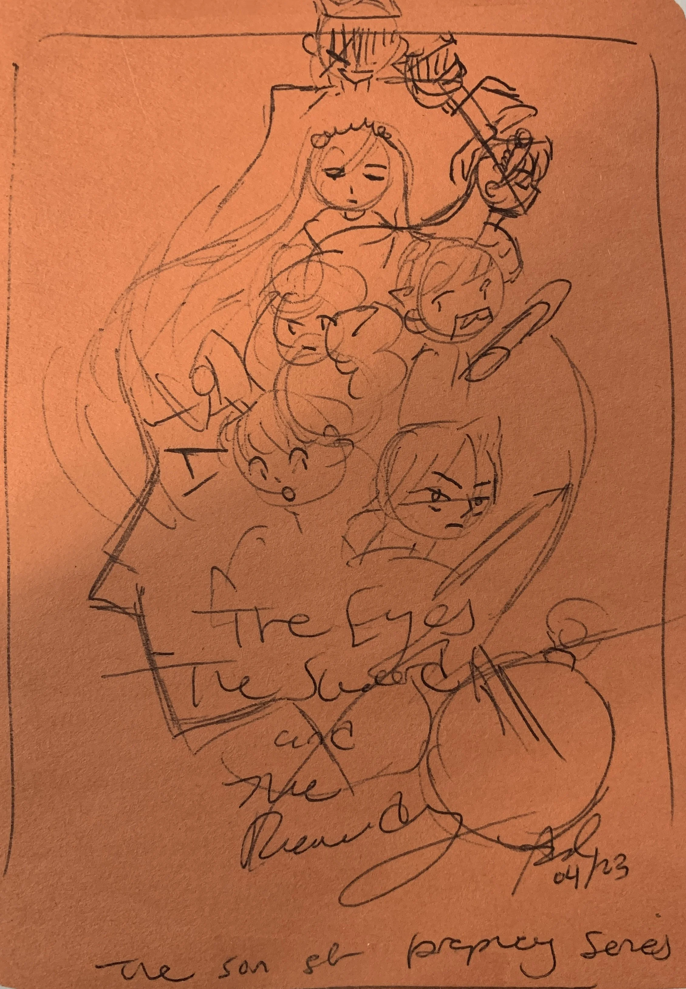
The three leads are the reason this series exists. The Eyes (Crow), the Sword (Lance), and the Remedy (Sage) were the first characters I imagined—riding horseback down a mountain. All I knew at the time was that they were triplets (Jesus-style) and each had a unique power tied to their title.
Eventually, I dropped the triplet concept—I like biological accuracy too much. They were reimagined as half-brothers, born of the same mother: a sorceress.
That single detail sparked the questions of how and why. Finding the answers gave the story weight and shaped it into something cohesive.
Their designs came later, but this early sketch was the first drawing I ever made of them—exactly as I pictured. Well, Crow and Sage were perfect; Lance was still a little hazy.

I really enjoyed this character reference (left) made by Nano Hiku. Emulating a similar style for my characters not only gave more insight into what embodies them, but also inspired my current art style—which you see used on the dustjackets.


Merchandise
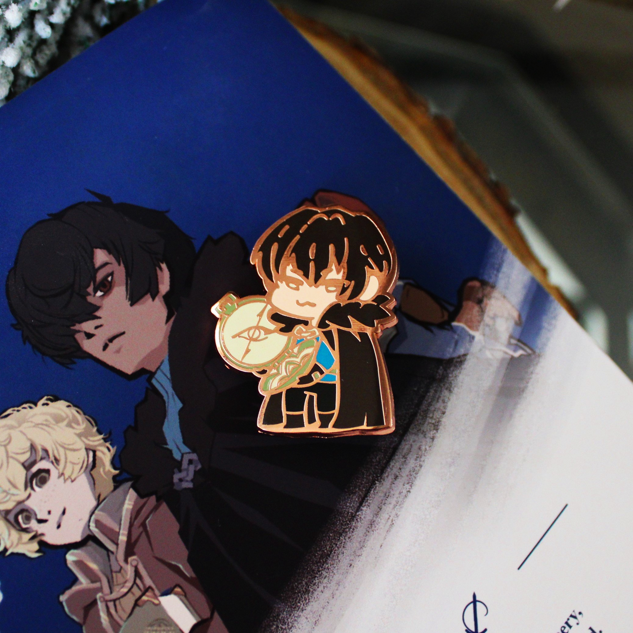
For the Kickstarter that funded the publishing of this novel, I created a few special goodies for backers—something I love doing. The items included a clear film page overlay, bookmarks featuring the same artwork, and hard enamel pins (because I love pins).
For the overlay, I knew I wanted to capture Crow at his lowest point—a moment when he’s lost. He’s surrounded by early autumn, symbolizing that he’s too late. He looks directly at the viewer, as if he knows they can’t help him anymore.
After several failed attempts, I finally discovered transparent film. The first print on it turned out beautifully. I even made a TikTok about the process—and it went viral.
Once the artwork was finished, the bookmarks came together easily. I had them printed in bulk, complete with gold-sprayed edges.

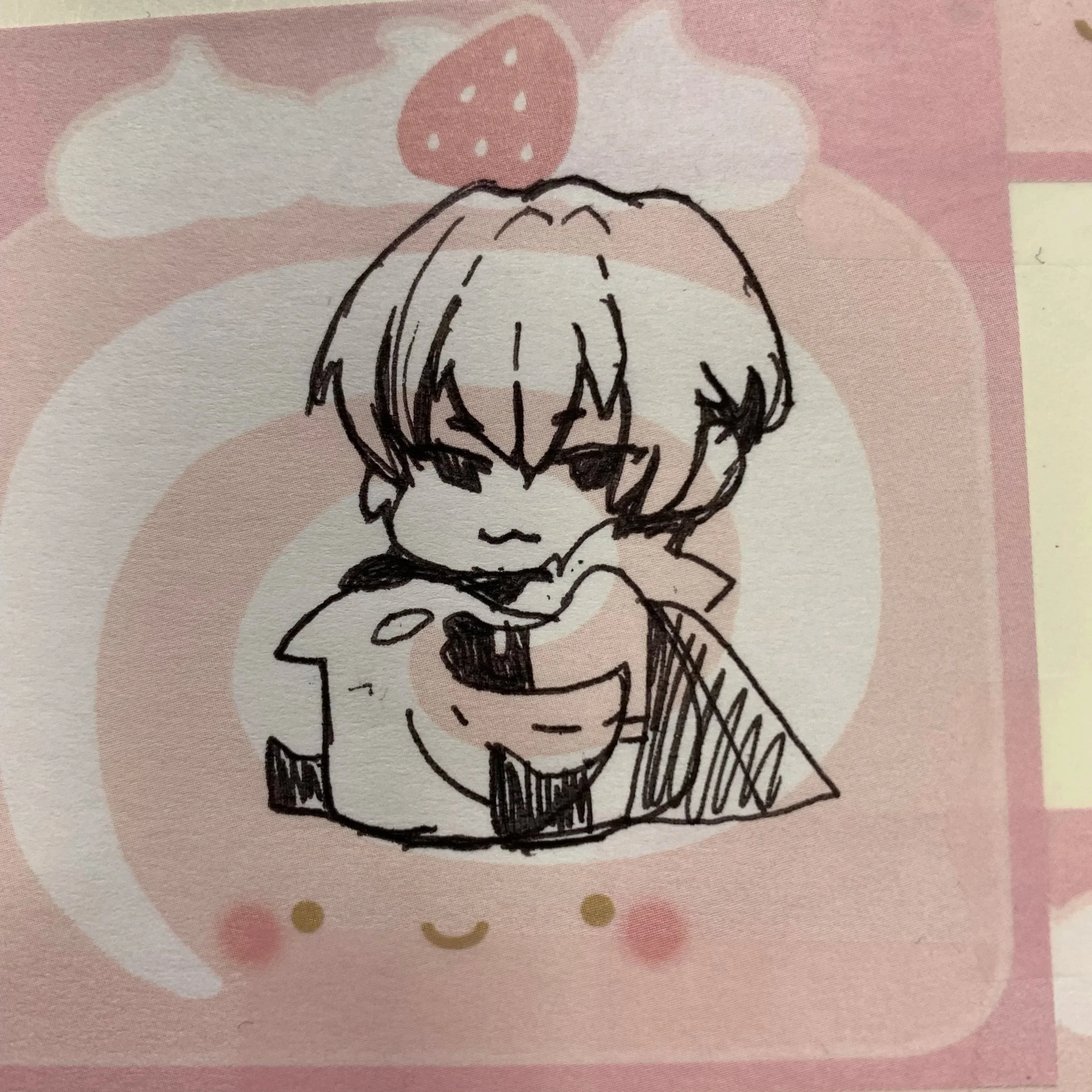
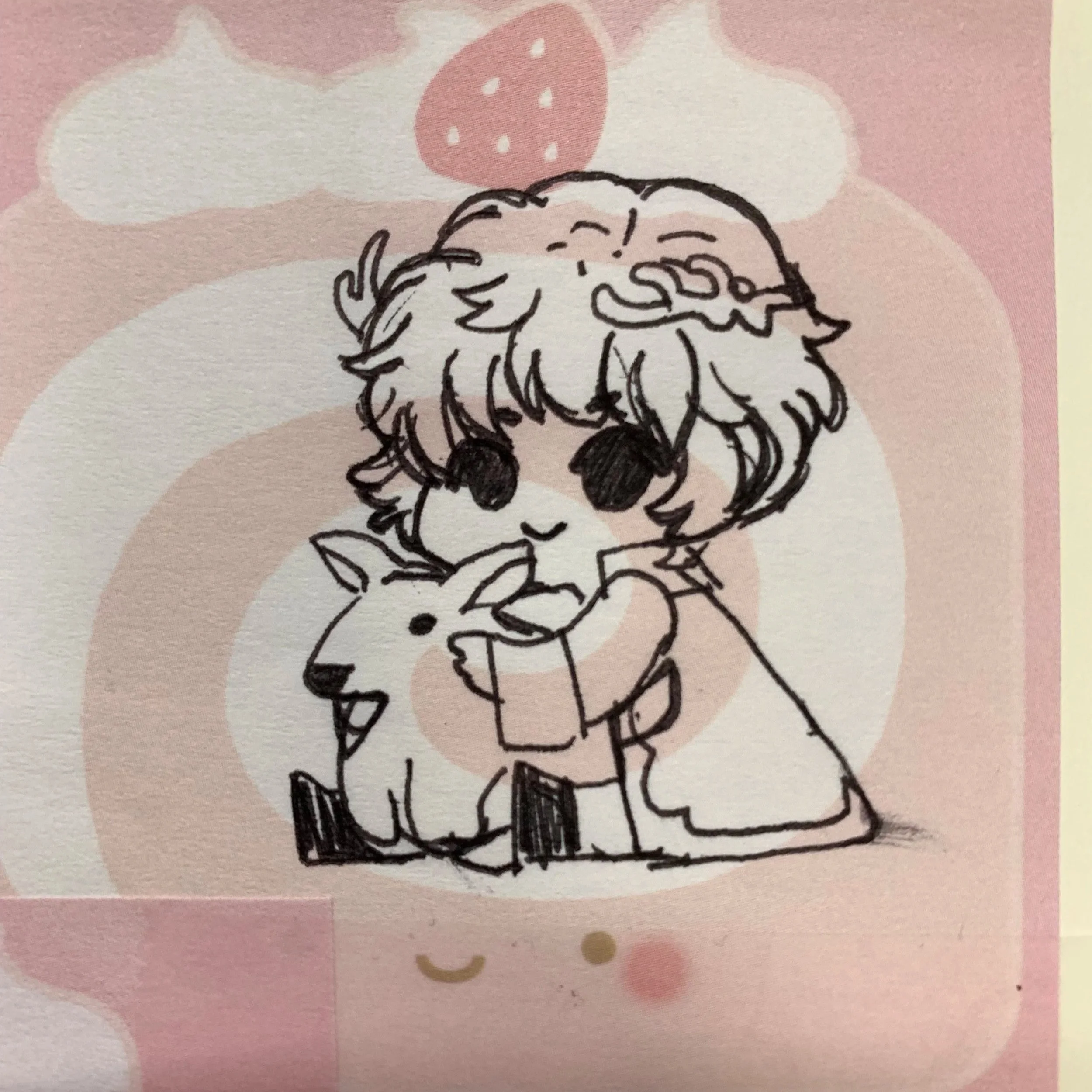
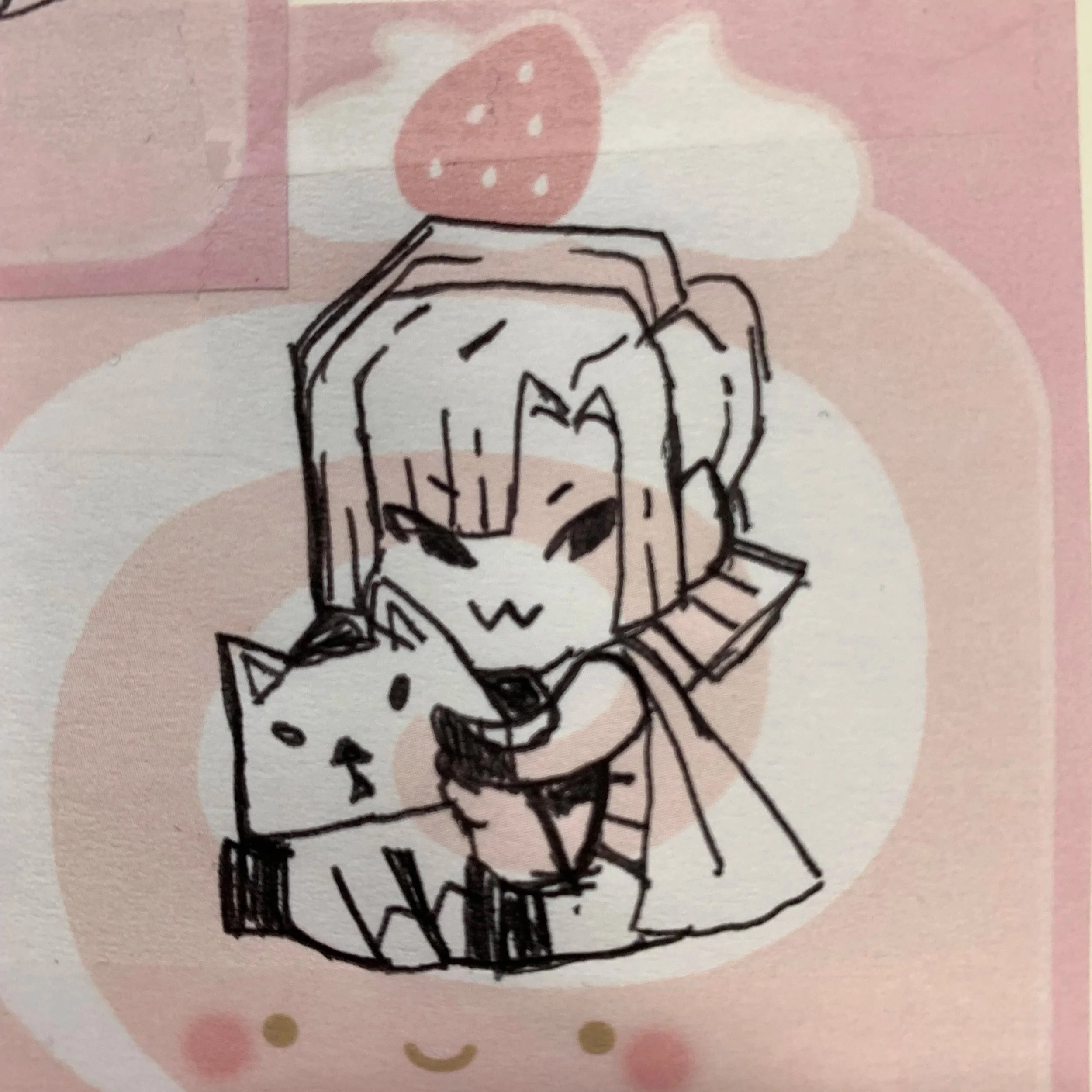
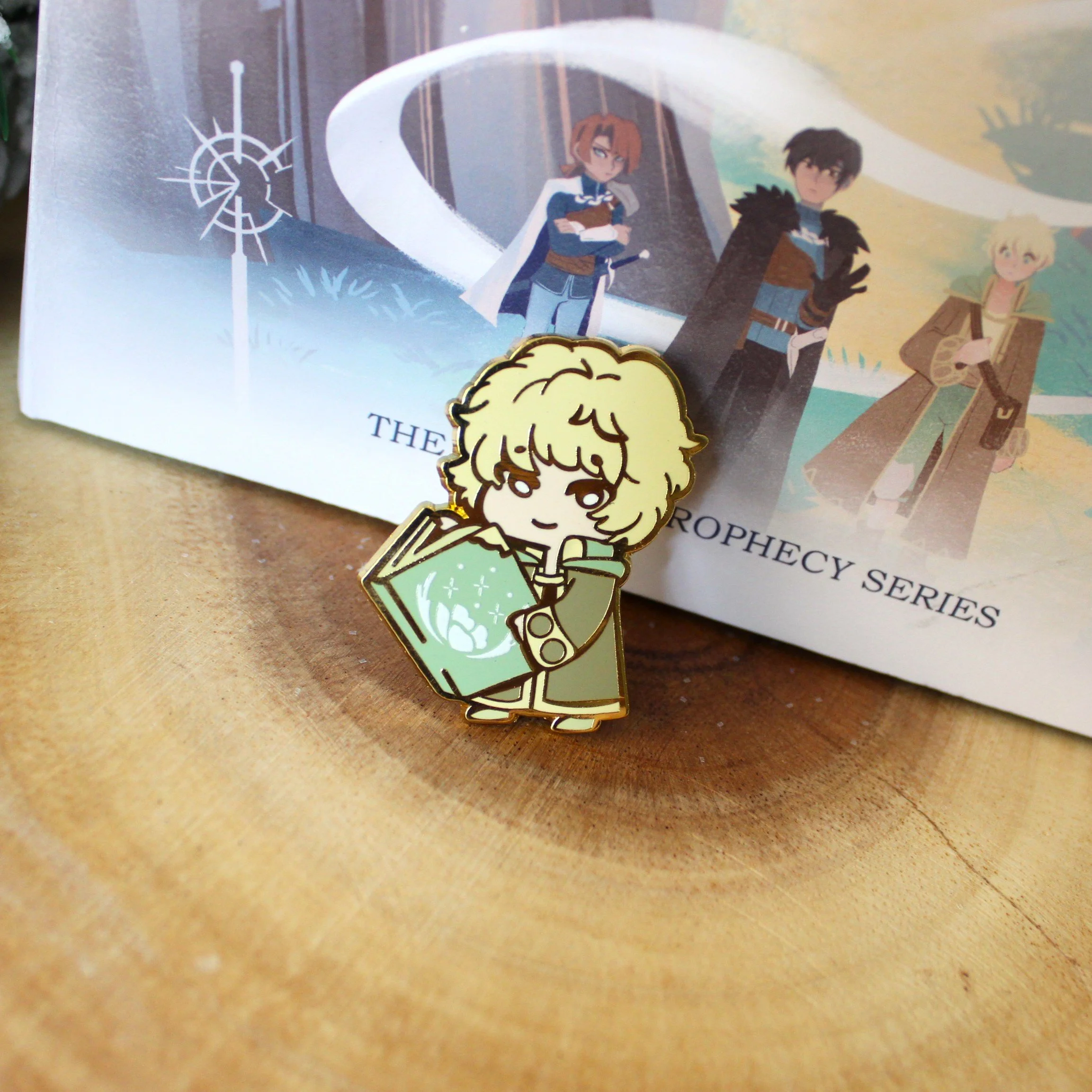
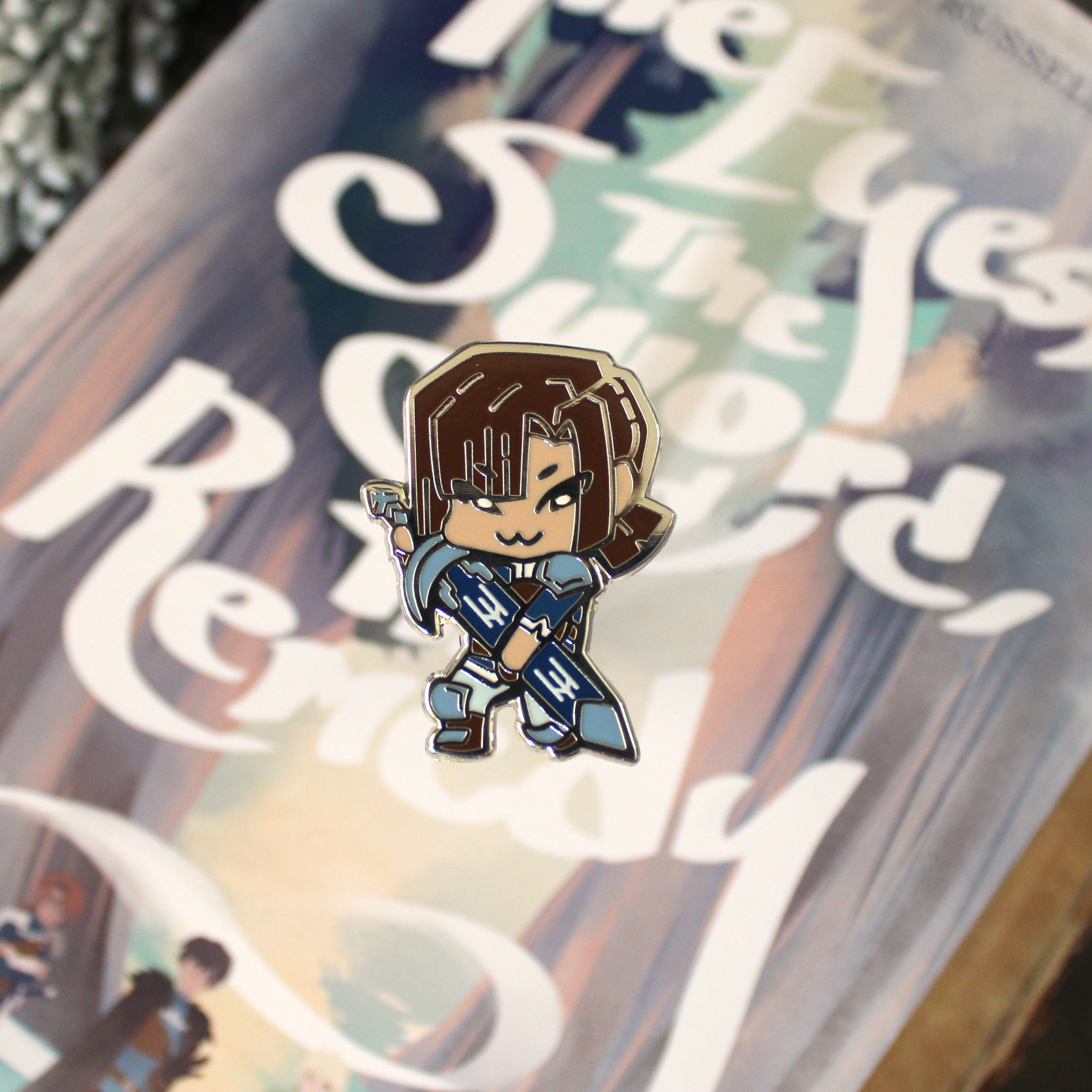
Hard Enamel Pins
The enamel pins went through a few design variations. I eventually settled on a cutesy style I first sketched on sticky notes. Originally, each character was going to hold their animal familiar—but Sage’s fawn ended up looking more like a kangaroo, so I swapped them out for their sigils instead.
I created the final designs in Clip Studio Paint, then converted them into vectors in Illustrator before sending them off to my manufacturer.