twisted loyalty.
book two of the Sons of prophecy series
Twisted Loyalty picks up immediately after The Eyes, The Sword and The Remedy, where the uncertainty and fog have lifted—only to reveal a harsh, unsettling reality. With its bold and brooding design, the second book signals a clearer, yet more terrifying path forward, as the truth of The Sons of Prophecy world comes into focus.
Truth can be painful. It's dark and heavy—but within that darkness lies hope and light. That contrast is what I aimed to reflect in the cover design.
The vivid red of the logo draws the eye, standing out against the looming shadow above. Every character, not just those on the cover, is forced to confront who they truly are. They must face their fears and step into the unknown—doing what must be done, no matter the cost.
Book Covers, Sigils, and Official Character Art
Concept
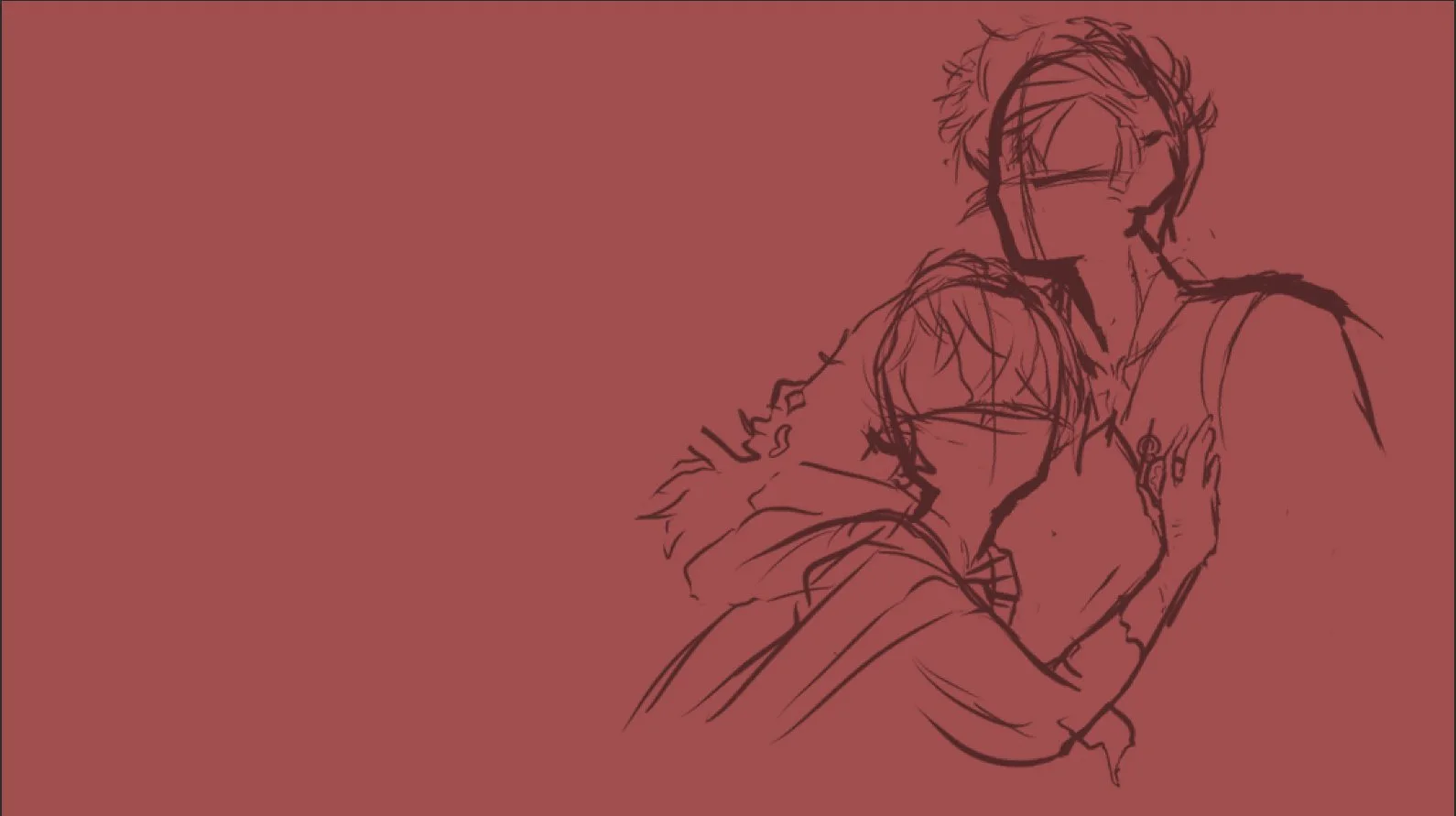
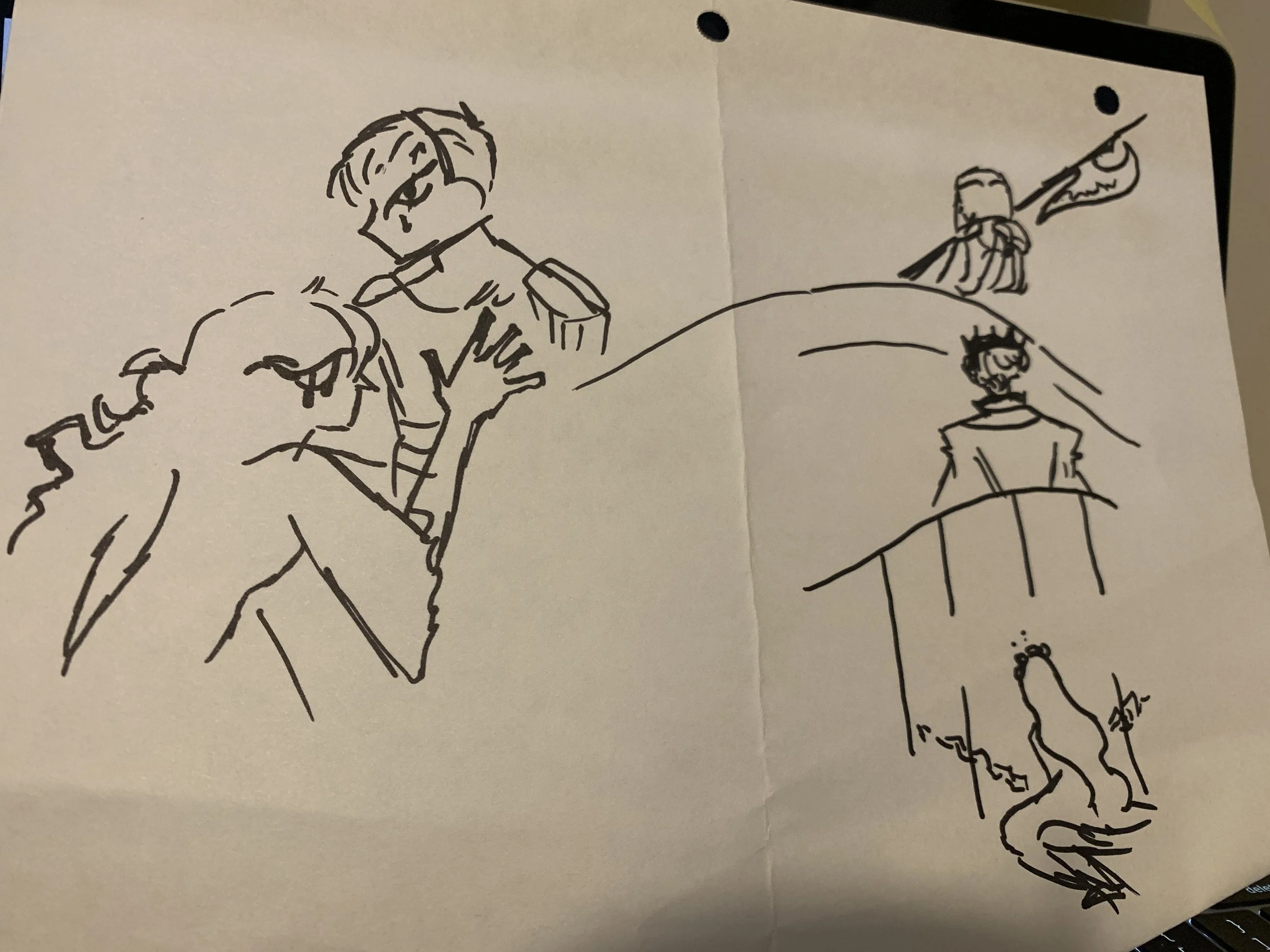
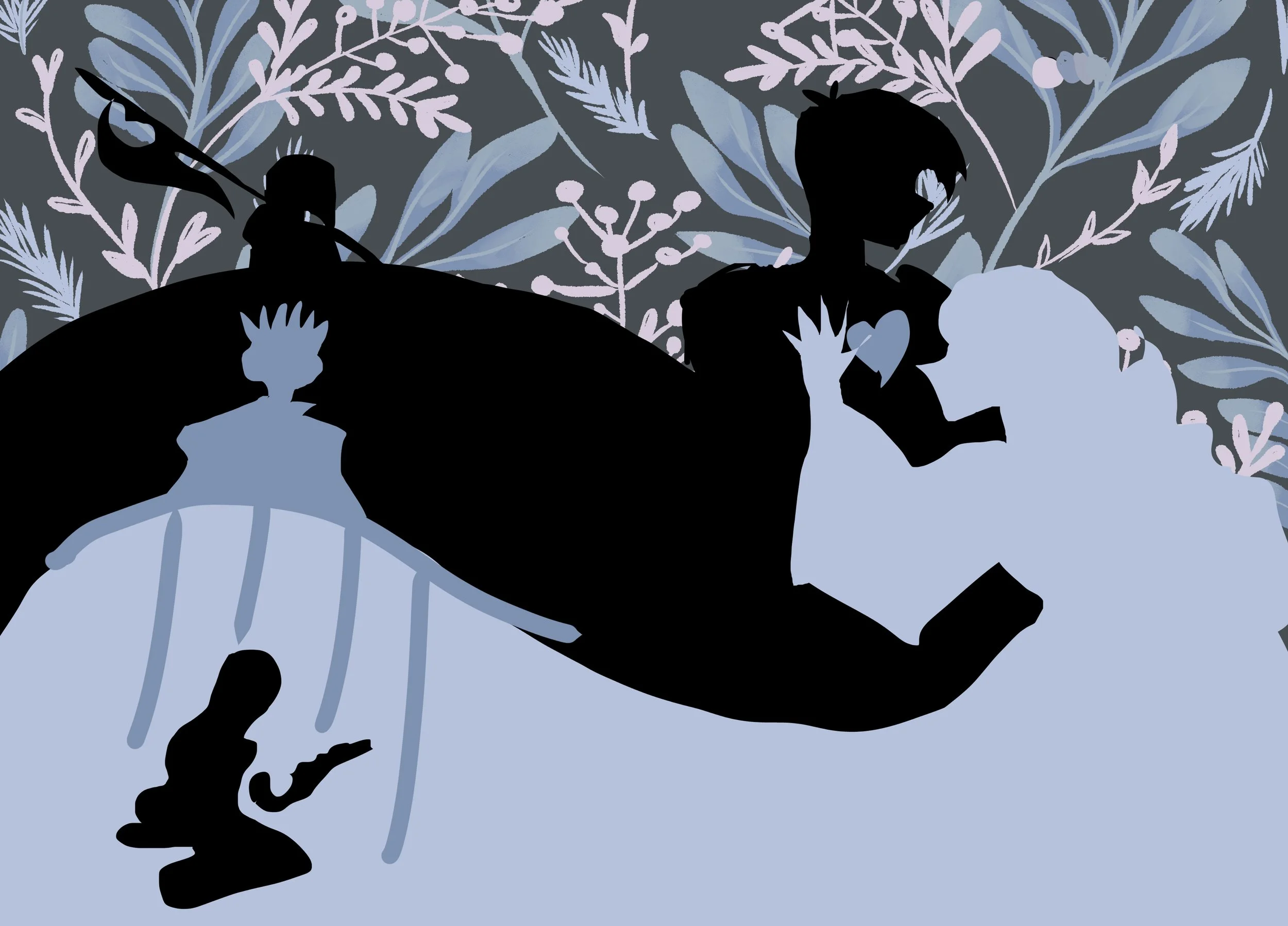
The second book in this five-part series reflects the deep uncertainty each character faces—a looming darkness that reminds them nothing is as it once seemed. Long-held beliefs begin to fracture, and trust is tested at every turn. Yet amid the chaos, there’s a moment of quiet resolve: Crow, the series' main lead, and Cress—who steps into the story as a central character—share a smile, their hands interlocked. It’s a visual expression of hope, found in one another despite overwhelming odds.
The bold, bright red of the title logo adds intensity, signaling to the reader the emotional weight carried within. Overhead, the red leaves arching above Crow and Cress serve as a layered symbol—frustration, rediscovered identity, and the quiet tension of unspoken desire.
Planning
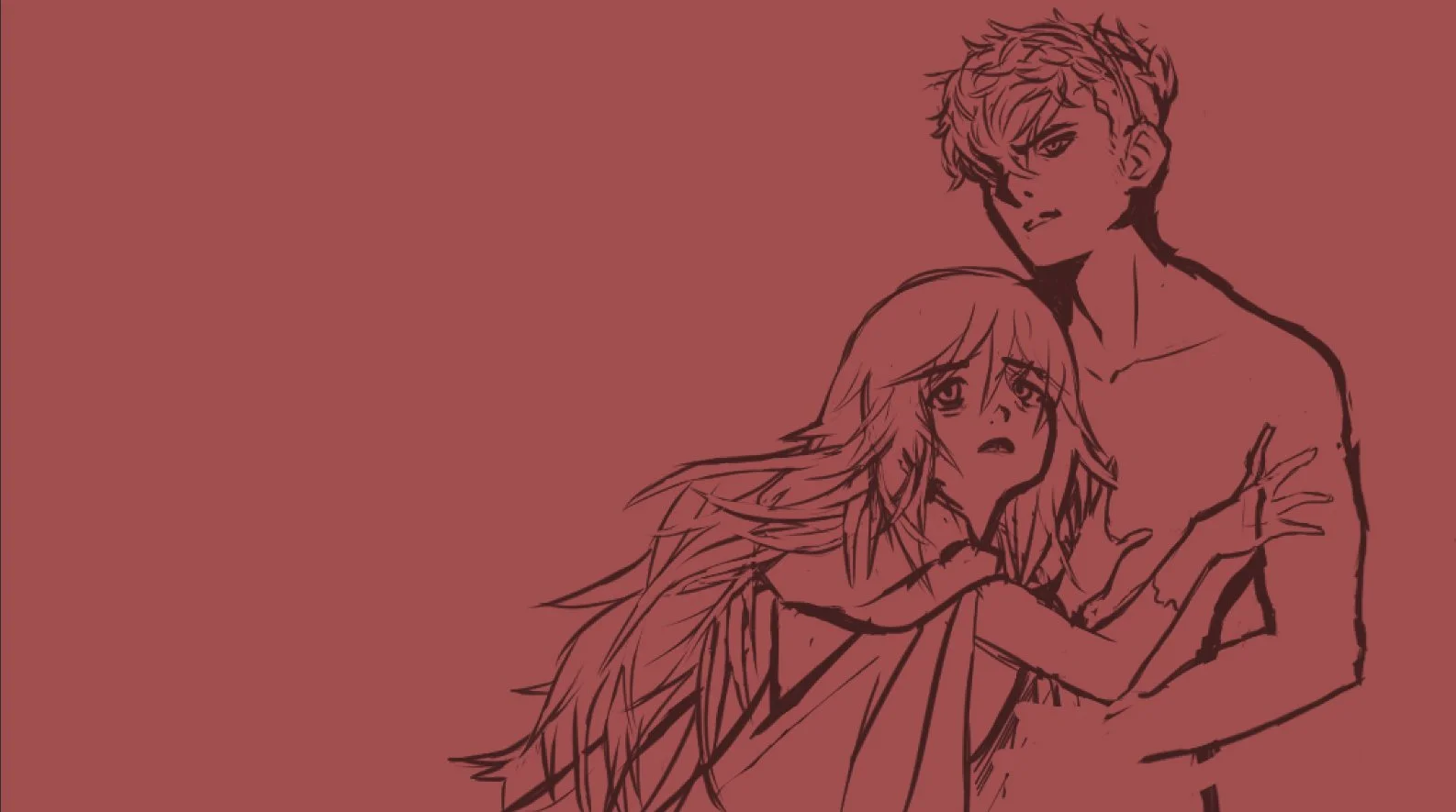
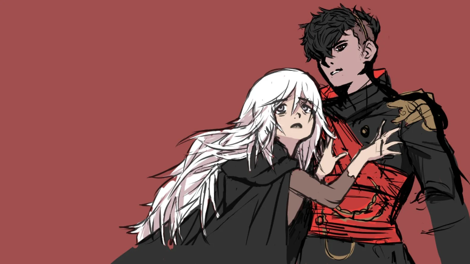
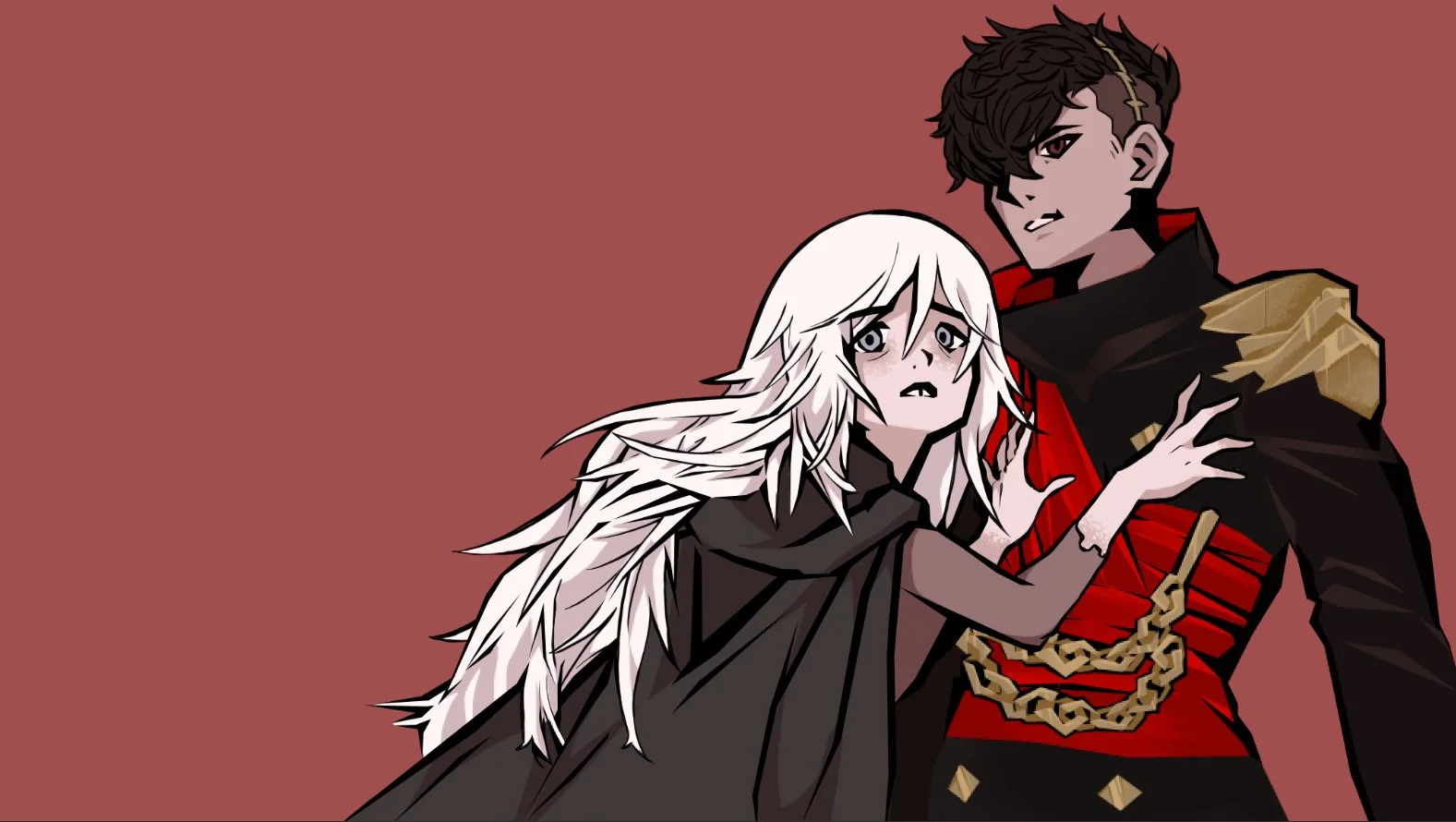
The cover art for Twisted Loyalty captures a pivotal transformation—Crow, no longer fully himself, glares outward with fury, his wrath seemingly directed at the reader. Cress stands beside him, holding him back, her expression etched with fear—not for herself, but for whoever he’s facing. That someone—be it friend or foe—is left deliberately unclear.
This visual tension reflects the heart of Twisted Loyalty: the uncertainty of allegiance. Who are they meant to fight? And more importantly, who are they fighting for?
Alternate Concepts: For the future Kickstarter, I’m considering two exclusive dust jackets for the other Sons—-Sage, and Lance. Their experiences hold just as much weight in Twisted Loyalty as Crow’s.


end sheets
Like Book One, the endsheet design for Book Two is inspired by packaging I came across while working in the postal service—specifically, the elegant work of SimplyGilded. I aimed to emulate a similar aesthetic for this book’s endsheets.
Since the story’s setting shifts from autumn into winter—particularly in the Firelands, where winter is eternal—I wanted to capture that seasonal transition. While the original palette leaned toward cool blues, I plan to shift it toward rich greens and reds to better reflect the mood and environment of the book’s design.

Character Design
Book Two introduces four new characters: Agatha, Lissanwick, Syed, and Cress—two of whom were first referenced in Book One.
Agatha originated as a D&D character I created for a potential campaign but ultimately found her true place in this world. As a giantess, she brings a strong barbarian presence to the story, expanding both the scale and dynamic of the cast.
Lissanwick—often called Liss—was an unexpected creation, initially appearing in a single chapter of Book One. However, her presence quickly grew in significance, eventually becoming pivotal to the overarching narrative. Her story added enough depth to warrant an entirely new installment: Ruby Eyes, now Book Four in the series.

Syed is an enigmatic presence—unexpected and elusive. Though not vital to the main plot, he serves as an obstacle to Crow, challenging his perspective in subtle but impactful ways. His mysterious connection to the looming antagonist, Dyardaridge, hints at a hidden history.
Finally, Cress—a character planned from the very beginning—steps into the story at last. Previously referenced with weight and mystery, her connection to Crow is undeniable. She emerges as a lead protagonist in her own right: a new point of view, and a powerful foil to Crow’s arc.
Dyard’s court
The book’s cover was designed before some key elements of the story had fully developed—one being the full vision for Dyard’s court. Liss and Syed are already part of this six-member group, with Crow eventually joining them.
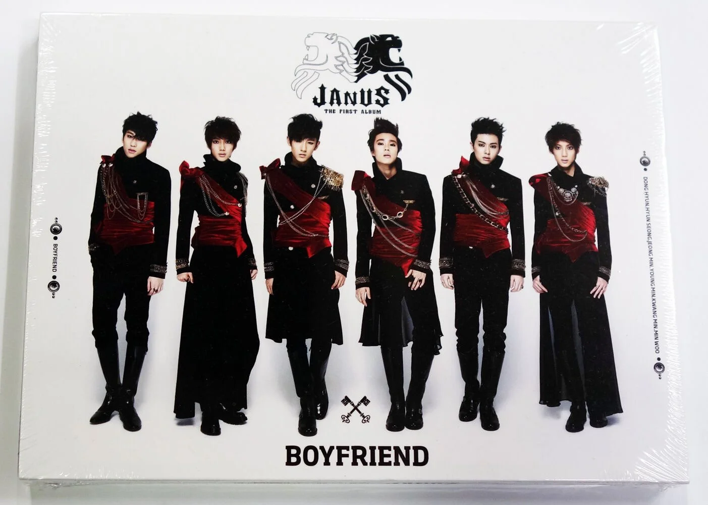
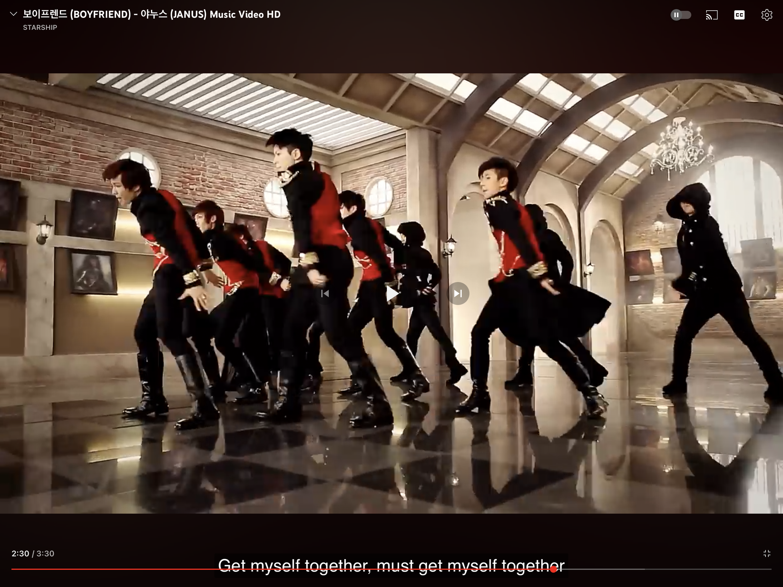
Their clothing and armour evolved into a steampunk-inspired, contemporary suit-and-tie aesthetic. Visually, the court draws inspiration from the K-pop group Boyfriend, particularly their Janus-Era concept. Crow, Syed, and Liss are specifically styled after members Minwoo, Donghyun, and Youngmin.
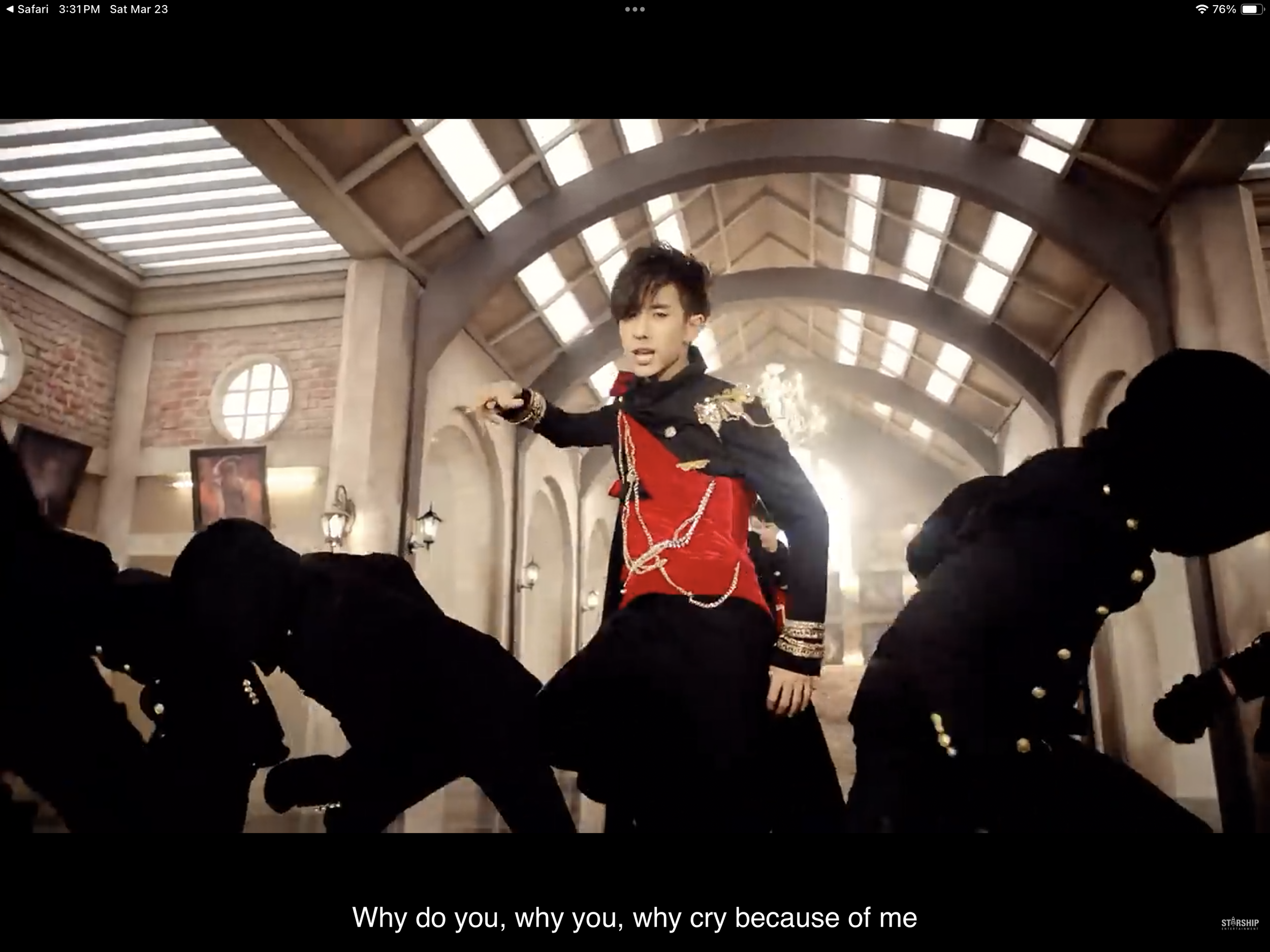
The lyrics from “Janus” also echo Crow’s arc.